EVERYTHING YOU SHOULD KNOW ABOUT THE PRO REBRAND
Category:You might have noticed things are looking a little different around here. After 34 years of unwavering dedication to working so no one is isolated because of Parkinson’s, the Parkinson’s Resource Organization is proud to launch a revitalized brand identity which reflects our continued commitment to the Parkinson’s community while embracing a forward-thinking approach to support, education, and resources.
This is a pretty big deal!
When we first discussed the idea of a rebrand, we wanted to prioritize a sense of continuity for our constituents and respect for our history while embracing our goals for the future and the demands of our hybrid virtual-reality world.
So what exactly goes into a rebrand? It’s a lot more complicated than simply swapping out a logo. A proper rebrand analyzes the core values of an organization, its short and long-term goals, its mission and identity and its shortcomings.
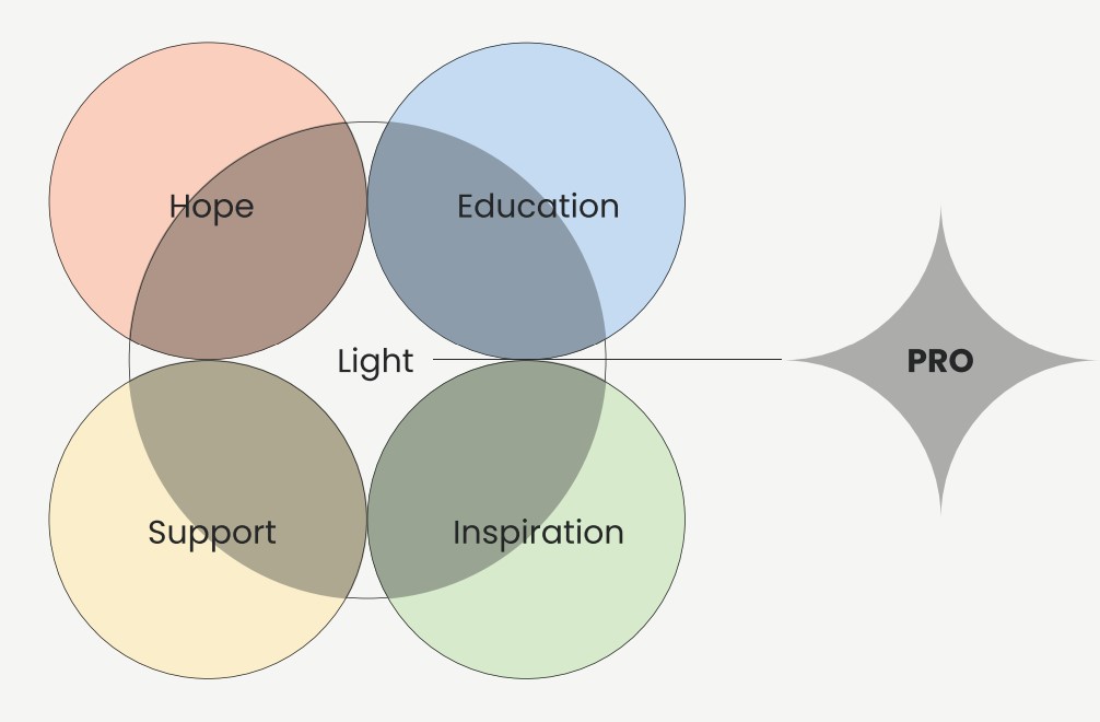
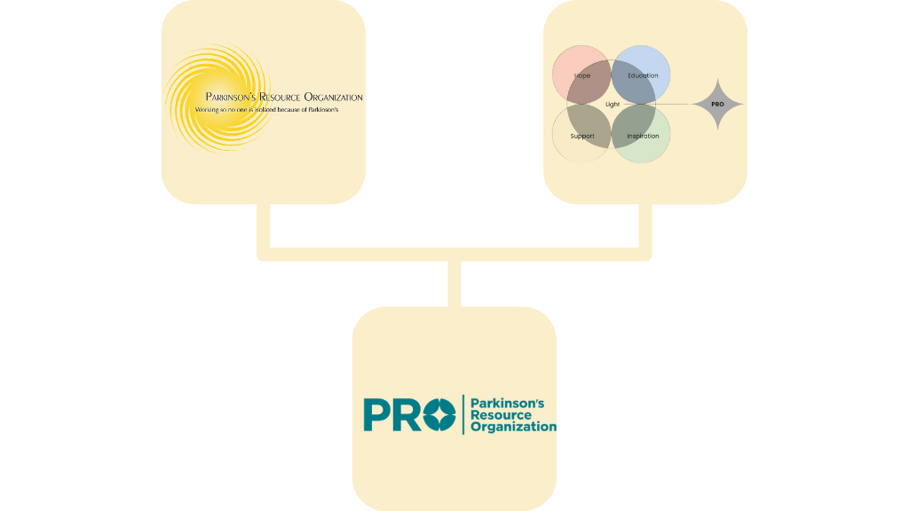
We started with our logo. The yellow sun logo served us well for many years; we actually worked very hard to fold the sun imagery into our new logo. After many iterations, however, it became obvious that PRO’s core values—hope, education, support, and inspiration—were driving us in a different direction. The new Logo does have a nod to the sun but builds off a cross section of the four pillars of our community to emphasize the strength of our commitment to these values.
Let the colors speak...
One of our top design priorities was accessibility. The updated design and communication standards have been carefully crafted to meet ADA guidelines so that everyone, regardless of physical and cognitive abilities, can access an inclusive and welcoming community. Subtle tweaks to our font and colors as well as the strong block logo all contribute to legibility. Even our white background and black font are carefully engineered for maximum readability—you’re actually reading an off-black font on an off-white background!
In fact, color plays a major role in the rebrand. Each color in our color family inspires a sense of calm, support, and comfort. Our strong teal remains the primary color, but we made subtle adjustments to reduce its vibrancy. We softened the yellow way down; both adjustments improve your eye’s ability to absorb the color both in print and on screens. At the same time, the teal serves as a bridge between the old brand and the new. We’re still the PRO you know and love; we just have some fresh window dressings.
What can YOU expect from this rebrand?
If you follow us on social media (you should!), you’ll notice some visual changes. Likewise with our emails, newsletter, and website – and you might pick up on the new font and colors, which hopefully make it easier for you to read our messages. Physical mail may still carry our old logo for a while – as a charity, every penny counts, so we’ll use our full stock of paper goods before switching over to the new look.
What WON’T change is our commitment to high-quality programming to provide emotional and practical resources for people with Parkinson’s, their caregivers, family, and friends. Let us know what you think!


Donors like you allow us to help thousands of families affected by Parkinson's.
Parkinson's Resource Organization is a United States federally recognized 501(c)(3) nonprofit charitable organization.
Tax ID #: 95-4304276
Our mission is working so no one is isolated because of Parkinson's. Toll-free support by phone: (877) 775-4111
- Previous Article
- Newsworthy Notes (October 2024)